A publishing platform that inspires and engages
Helping CEOs tell the stories that unite their workforce
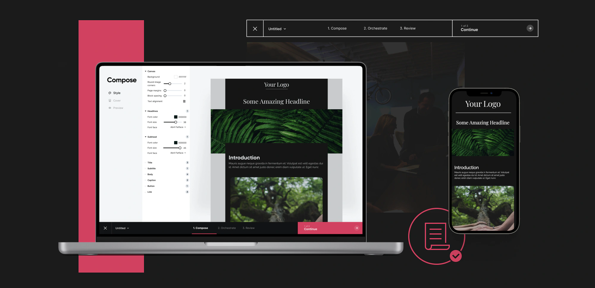
Organizations approached internal communications with old mediums: email, intranet, news feeds, digital displays, etc. We wanted to create a single publisher, delivering to any endpoint, and orienting the writer on their strategy and messaging itself rather than where and how the message was delivered.
MY ROLE
I worked closely with product managers and engineering leads throughout iterations. I led user testing sessions to validate assumptions and learn. I was the primary designer for the project, managing freelancers as needed.
PLATFORM
Web app
TIMEFRAME
2021
RESPONSIBILITIES
Information Architecture
Prototyping
User interviews
UI design
Design system
Handoff to engineering
Setting the stage
Enterprise Internal Comms teams and individual contributors used the current platform, from team managers to executives. They would send a targeted message to a small group or tens of thousands of employees. Use cases range from critical updates, culture, team news, change management, and so much more.
The current publisher was falling short in a couple of areas. First, there were gaps in email communication and the flexibility of the email designer. It wasn't taking full advantage of the platform's automation in delivering communication. Finally, the UI inconsistencies were hampering the user's ability to use some features.
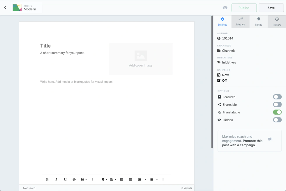
Outdated article publisher
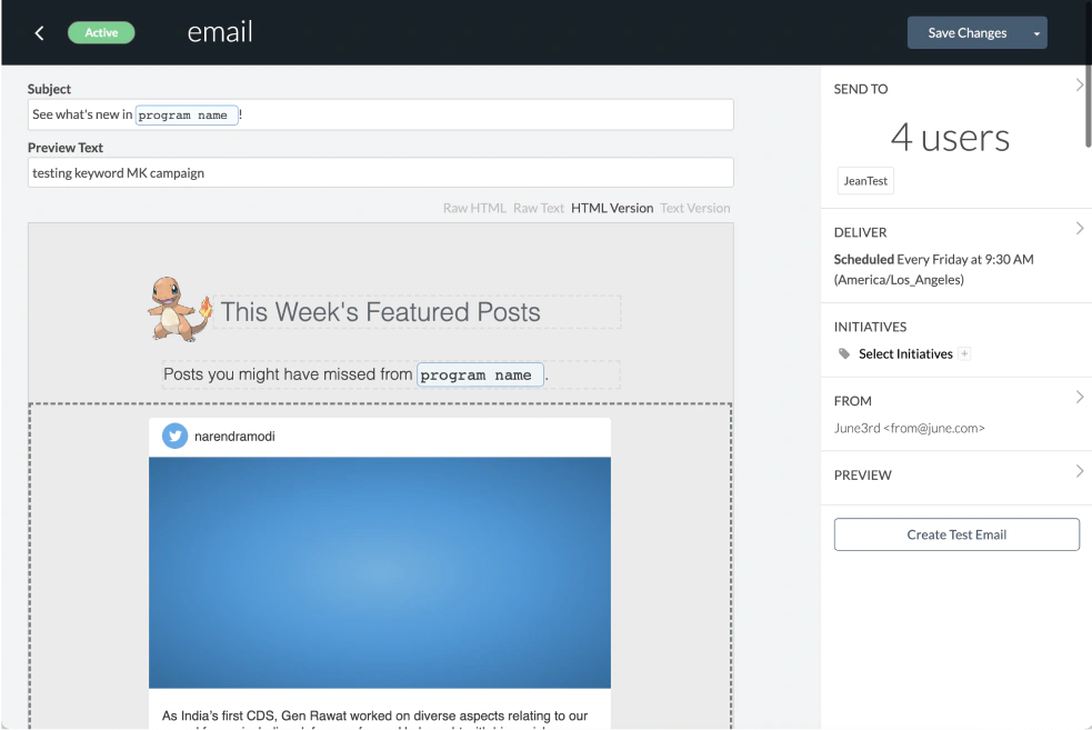
Outdated email composer
High level goals
Leverage automation
Amplify every communication with automated intelligence
Effortless experience
Create an effortless experience for first-time and power users to achieve their communications goals
Immersive content
Deliver immersive consumer grade content experiences for our people with a rich content editor.
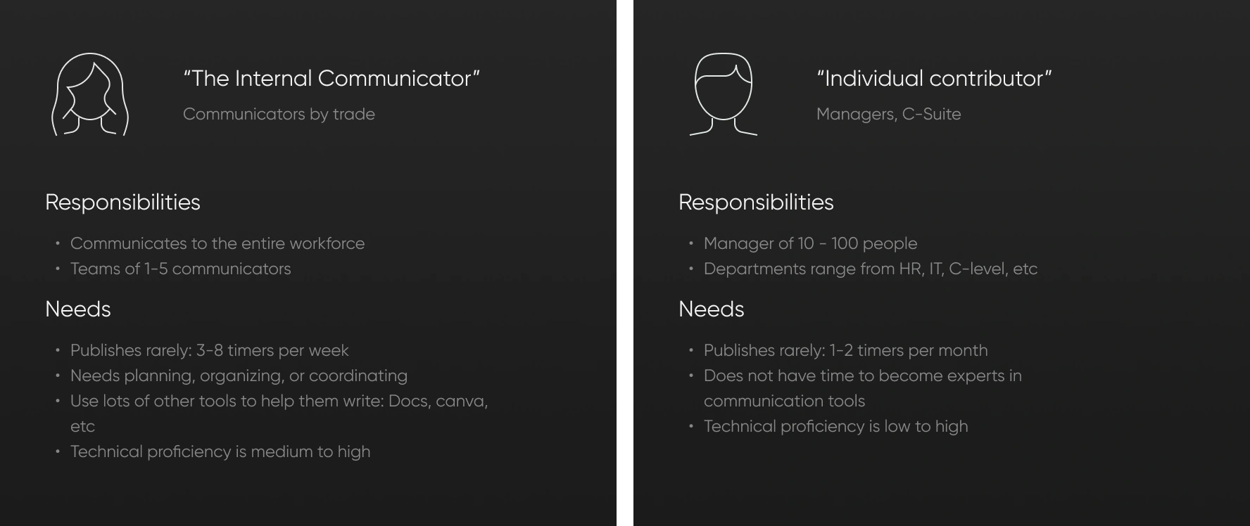
Who is publishing?
There were two primary personas with diverse experiences, expectations, and needs. The platform would be easy to adopt by optimizing for the novice user. Power-user options could stay hidden, only available when needed. Then, power users could be leveraged to enable novice users.
Northstar
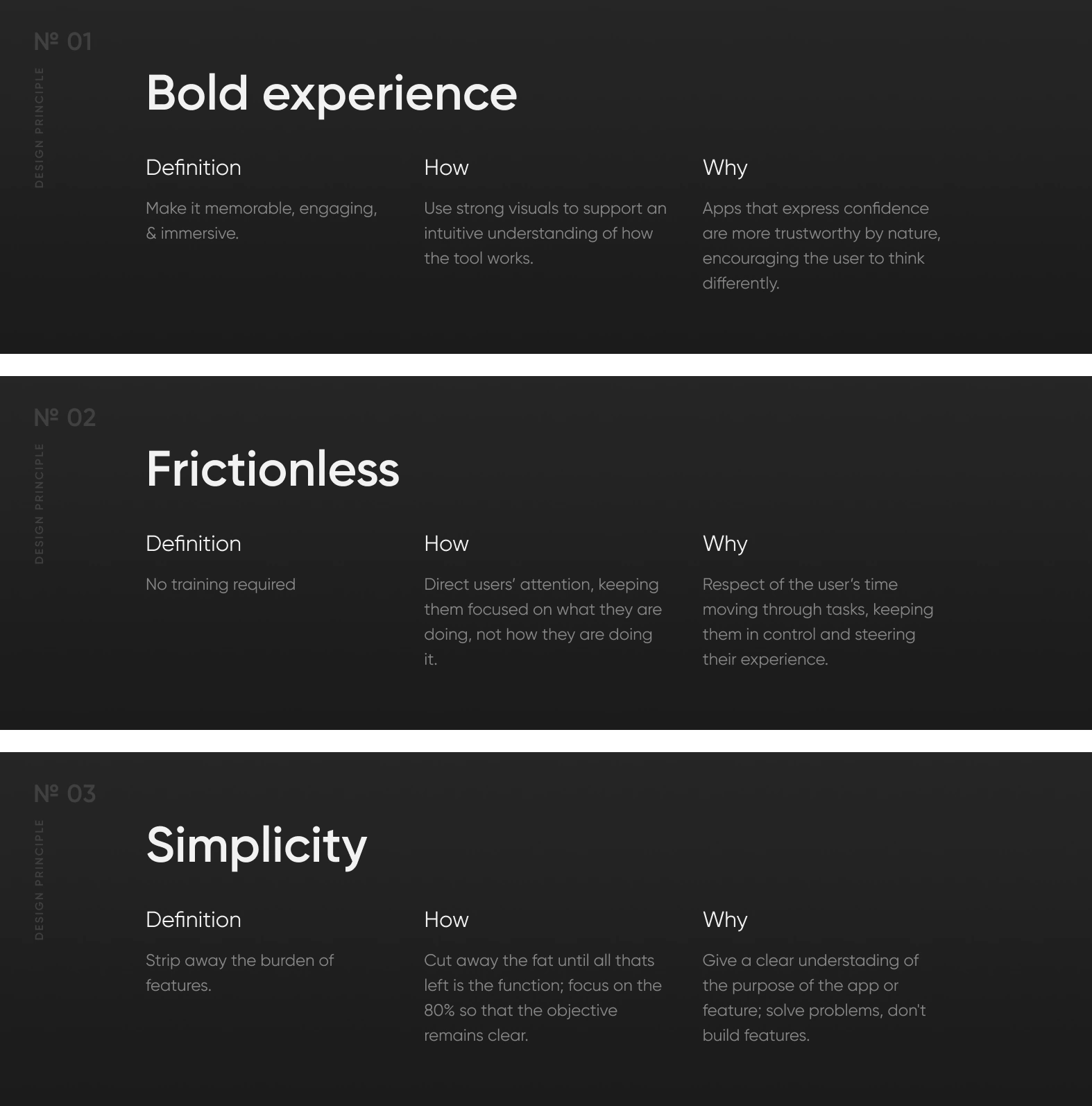
Keeping the experience tight and concise was very important. So I created these design principles to guide hard decisions around layout, interactions, flows, etc.
Research and validation
We reviewed with customers early and often because of the enormous scope. I helped facilitate a series of user interviews and user testing sessions every 6-8 weeks, each time with 4-6 active customers. Some of the things I wanted to validate and iterate on:

No. 1
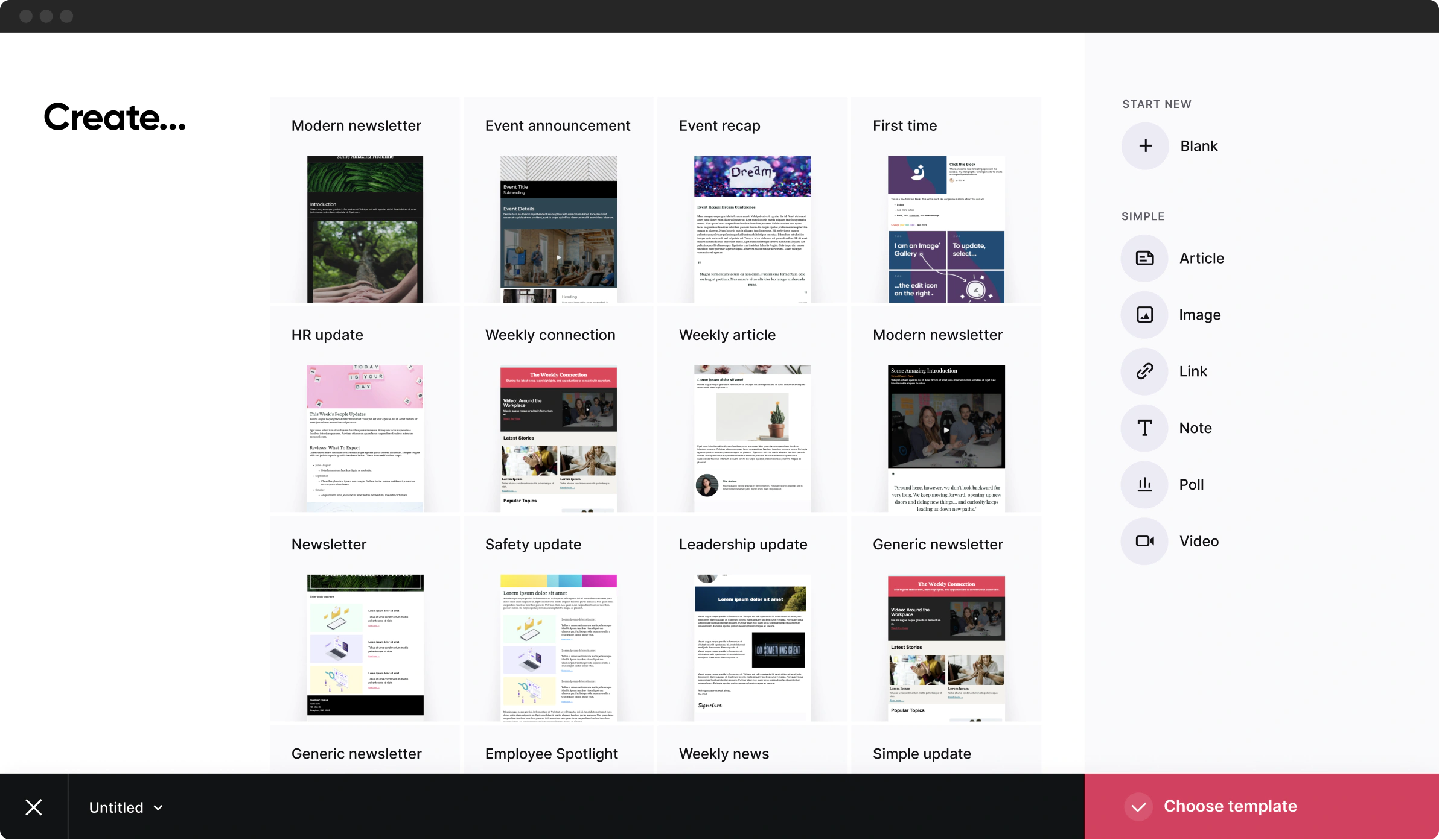
Start with confidence using templates
The goal here wasn’t just to provide templates; it was to inspire with attractive options, speed up their workflow with relevant use cases, and enable future communications with creating custom templates.
No. 2
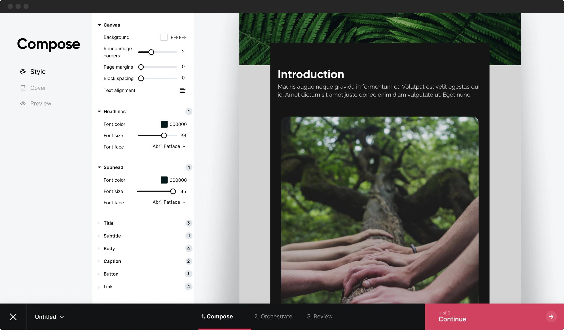
Compose a message worth reading
This tool needed to be powerful, but if you solve for everything, you are exceptional at nothing. I want the user to focus on what they are doing, not how they are doing it. Optimizing for how the writer thinks the made the tool invisible.
No. 2.1
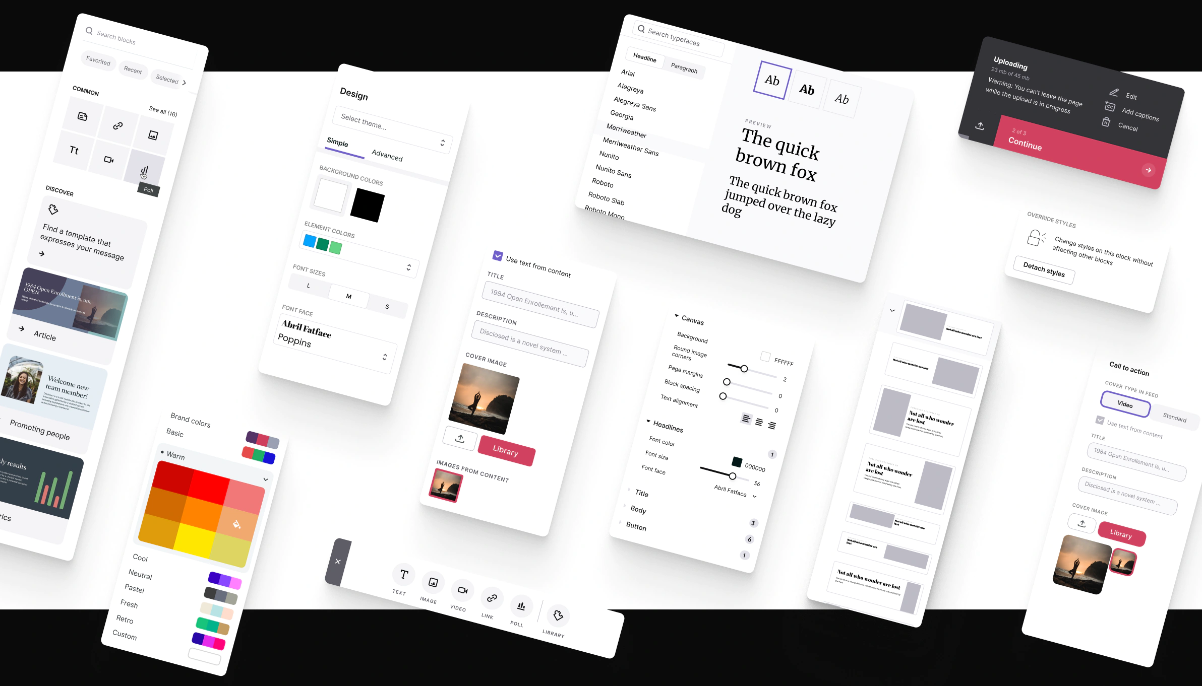
Contextual editing to create a smooooooth experience
I added inline controls to keep the experience feeling light and intuitive, giving the user quick controls over varied layouts, spacing, fonts, colors, spacing, etc. This made the user feel they have personalized their message while still adhering to the strict rules of all endpoints, like emails.
No. 3
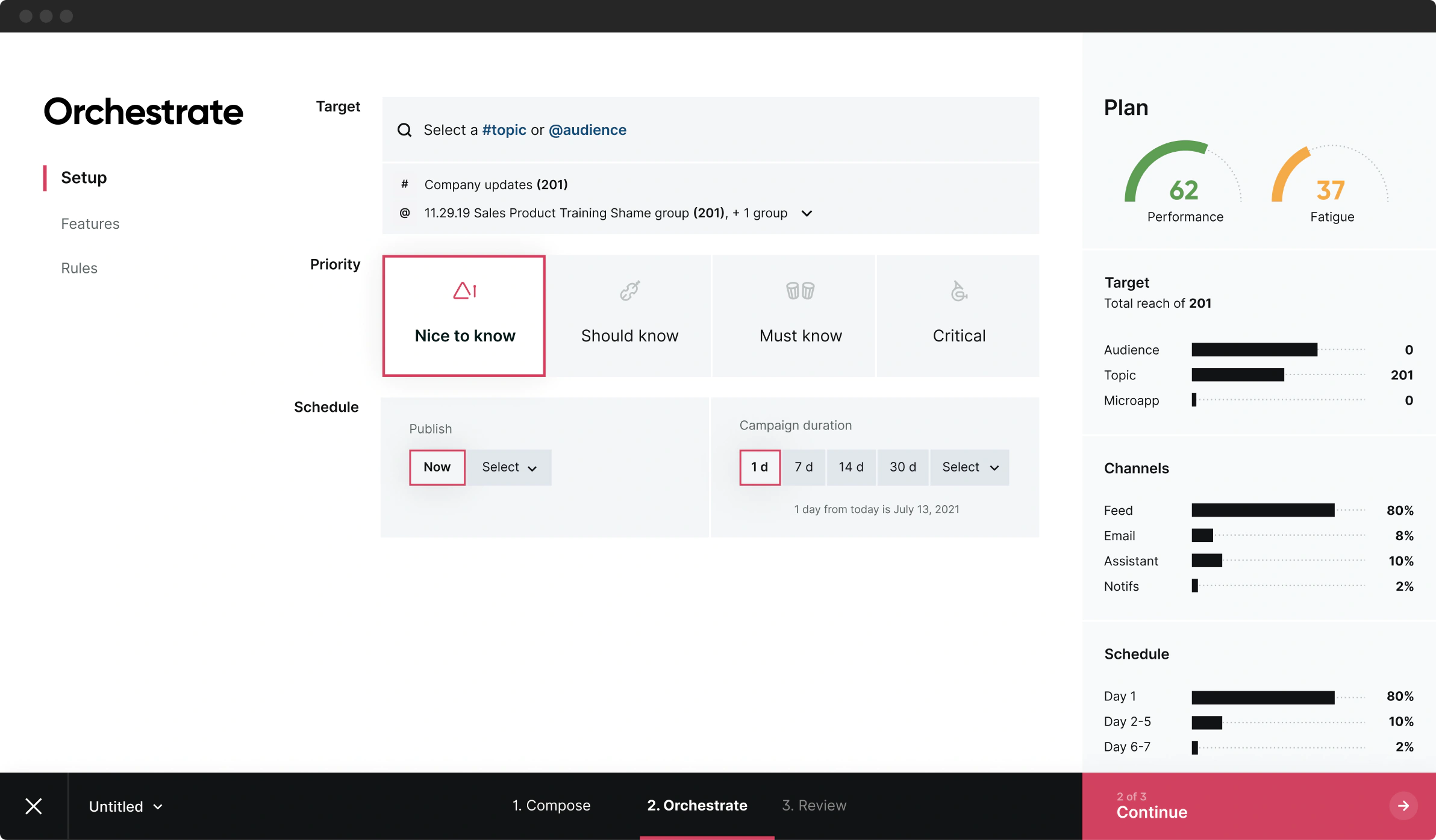
Campaign automation made easy
By adjusting a few levers, the expected performance of the campaign can be easily understood, keeping the author focused on the overall plan and less about when, where, and how the readers would engage.
No. 4
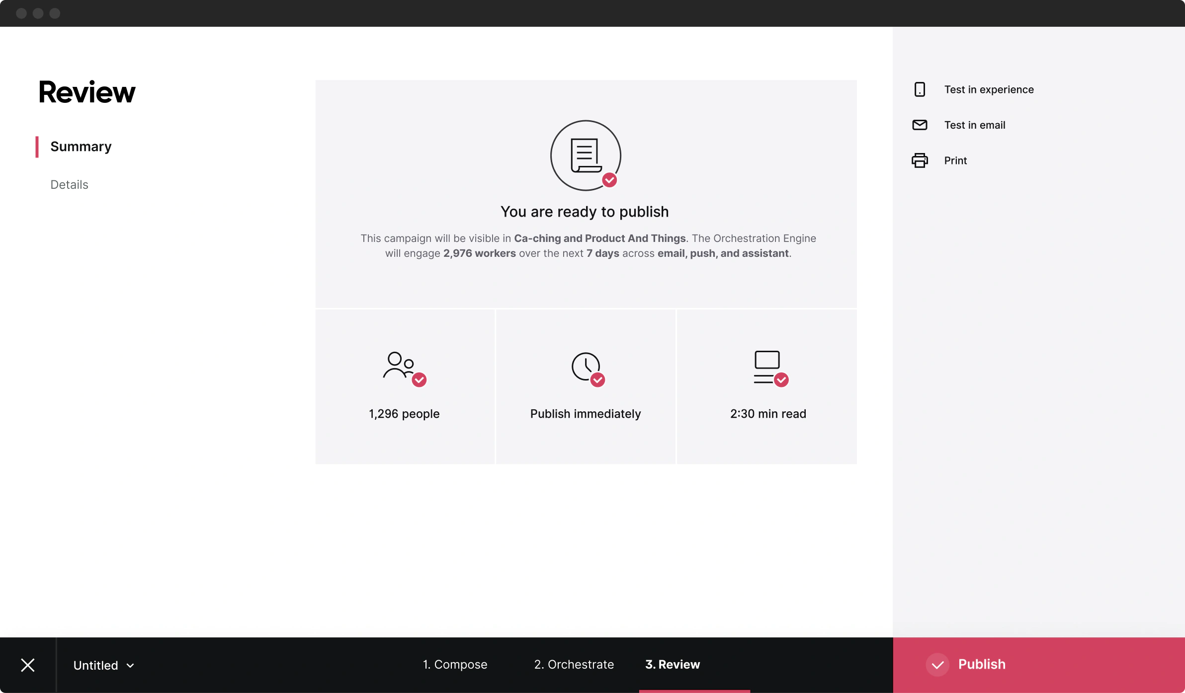
You’re about to publish — take a breath, relax
When publishing to a large audience, there is a moment of hesitation full of fears about typos, sentiment, engagement, right audience, etc. This page aims to put the mind at ease as it acts as a security safety net.
No. 5
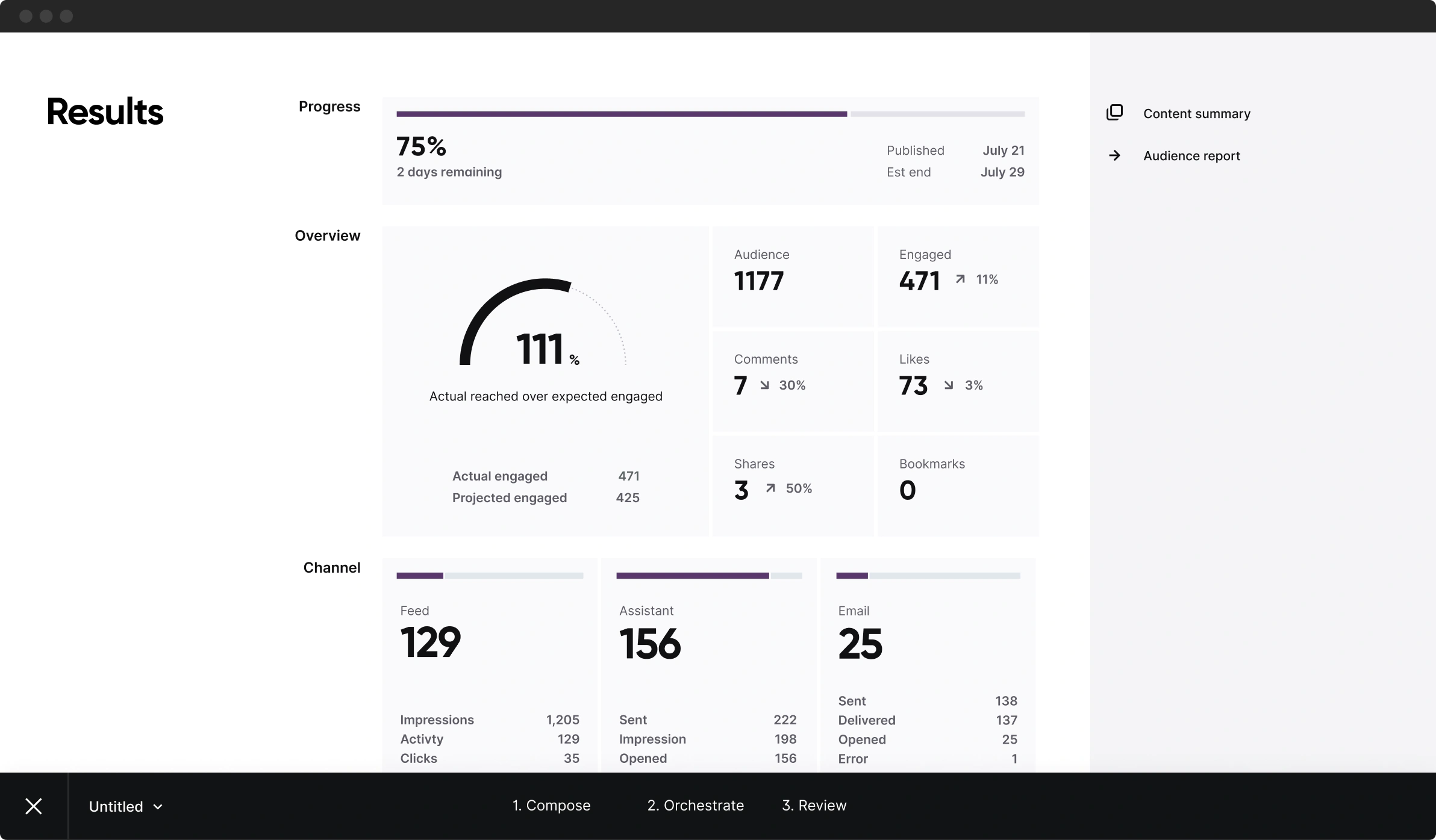
Was it a success?
The goal here is to help the author game the system; by learning the cause and effects of their message and settings, they can understand the things that affect engagement and readership, ensuring future campaigns will have ideal performance.
Marketing created this sizzle reel for the yearly customer conference
In conclusion
Going forward
Although the product org tracked metrics for product KPIs which were already pretty thorough, I wanted to take it a step further by having a consistent approach for all design work going forward. So I used Google’s HEART Framework for measuring UX, which included both qualitative and quantitative data.
Reflections
There was a "chicken or the egg" scenario in scaling the design system and design processes. It was challenging to balance the system's needs and adequately support engineers while still exploring the unknowns that would push the boundaries of defined components. This is a constantly evolving process at any organization but was heightened during this project.
© 2025 ✦ All Rights Reserved
